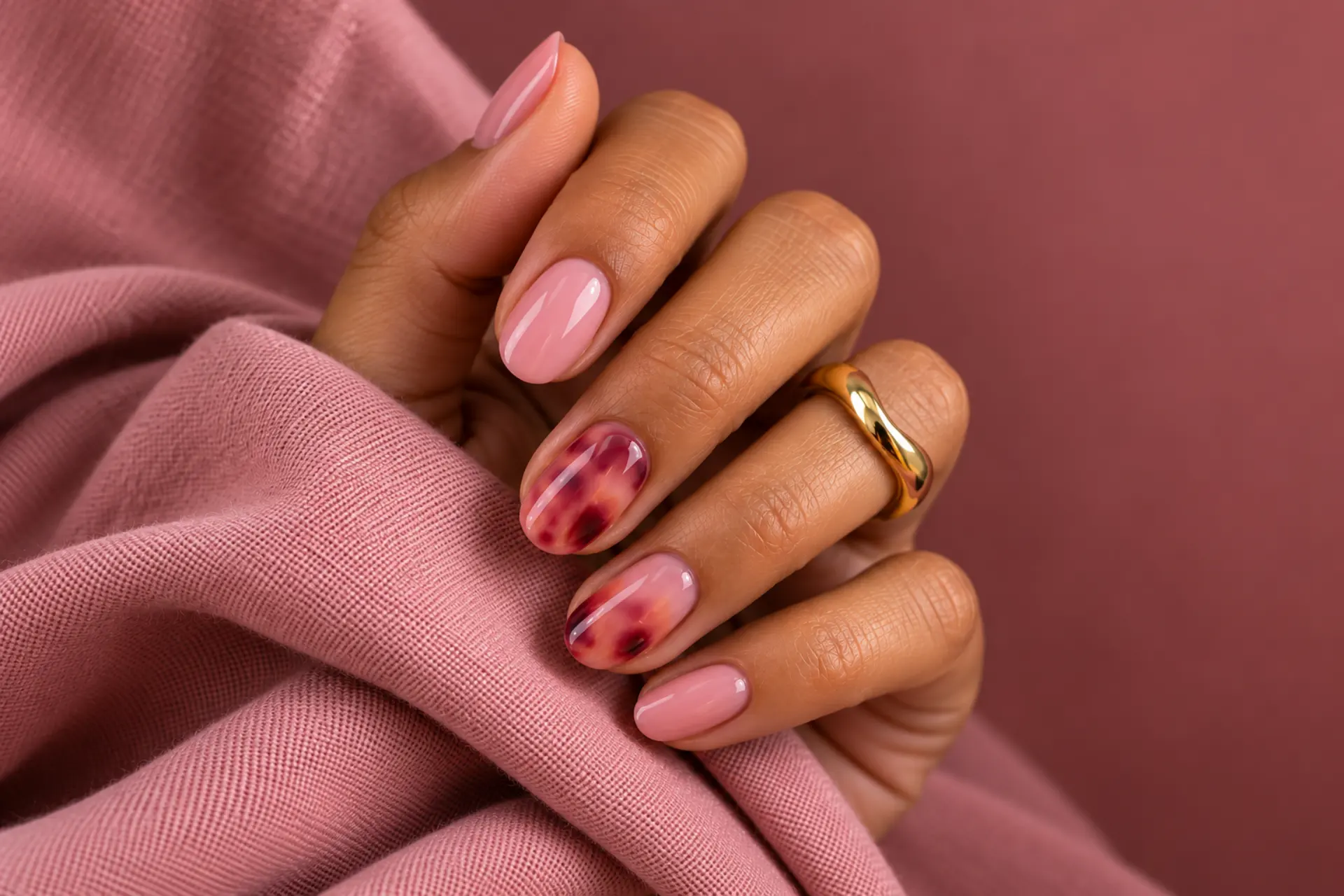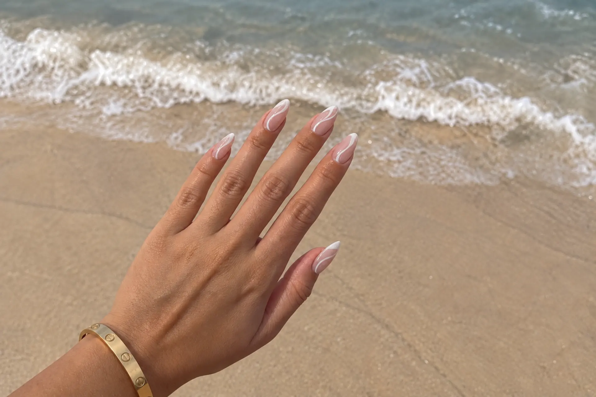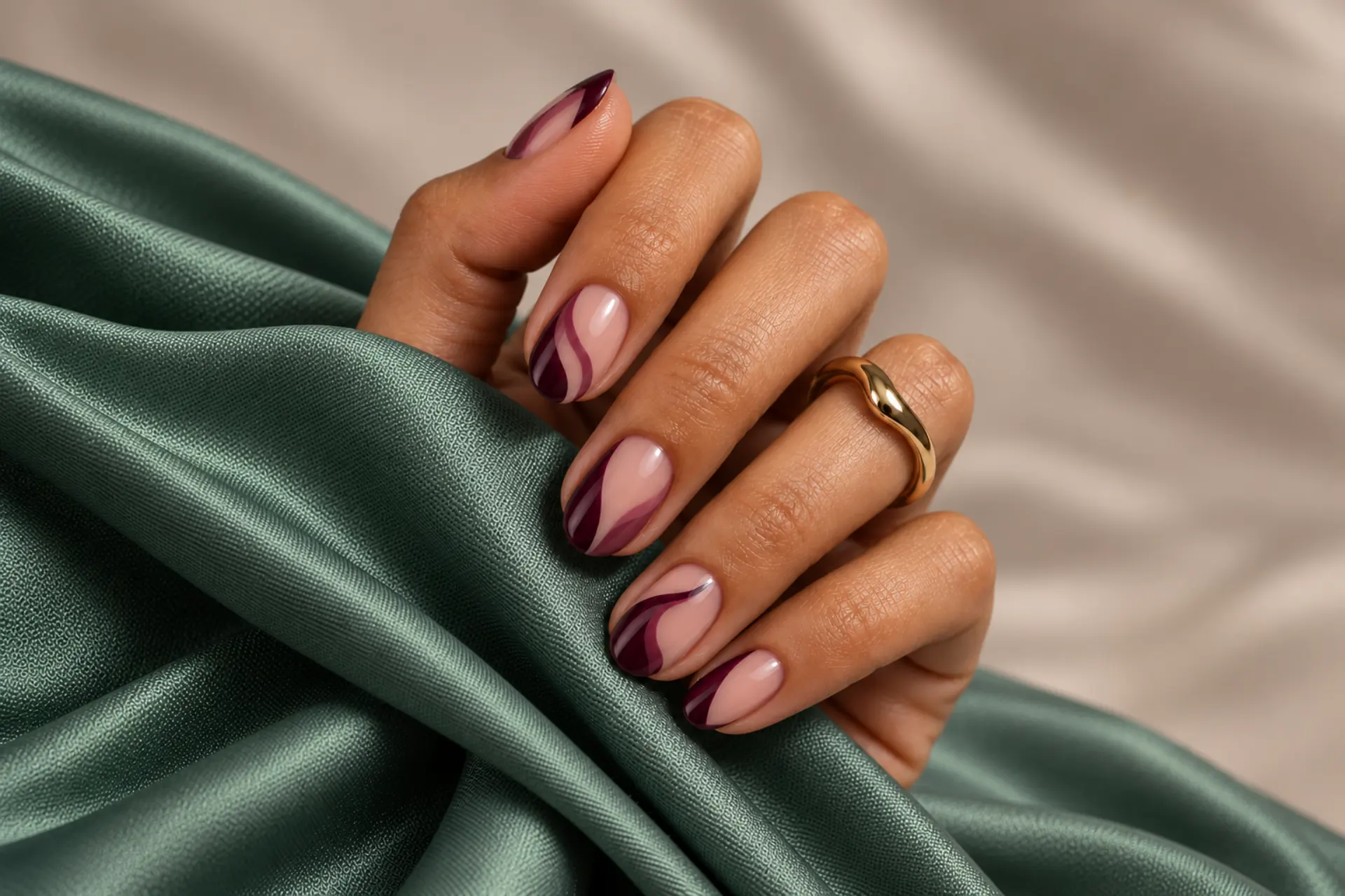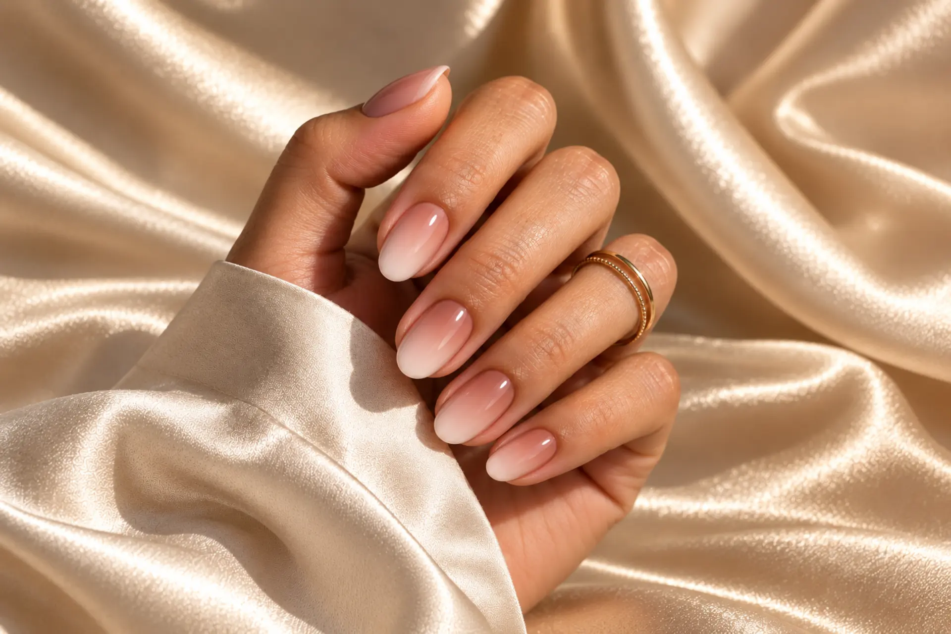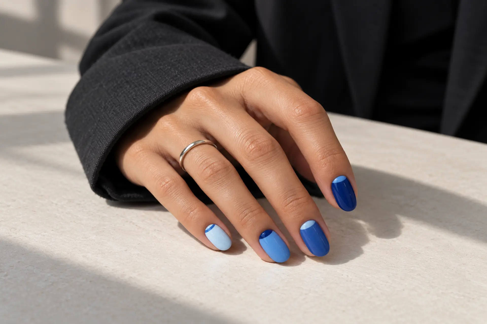
Choose Powder Blue High-Gloss Solid if you prefer even full-coverage color. Blue Tonal Aura Fade is an alternative built around a diffused center glow. Keep the finish and accent size appropriate for your nail length.
Powder blue softens a manicure; cobalt is graphic, denim feels muted, and inky navy can look almost neutral. Powder Blue High-Gloss Solid highlights even full-coverage color; Blue Tonal Aura Fade instead offers a diffused center glow. These choices produce different effects even within one color story.
Blue jelly changes as the nail underneath shows through, whereas metallic blue reflects a stronger highlight. Test undertones against your skin in daylight before deciding which photo to copy.
Look closely at Blue Micro-Dot Accent before choosing a final reference: its small, deliberately spaced points may need to be scaled for your preferred length. Consider whether you want a continuous solid color or just a small accent.
powder blue, denim, cornflower, cobalt, and inky navy
medium-short soft almond or squoval, realistic and wearable
Decide whether you prefer even full-coverage color or a diffused center glow before asking for extra art.
Powder Blue High-Gloss Solid
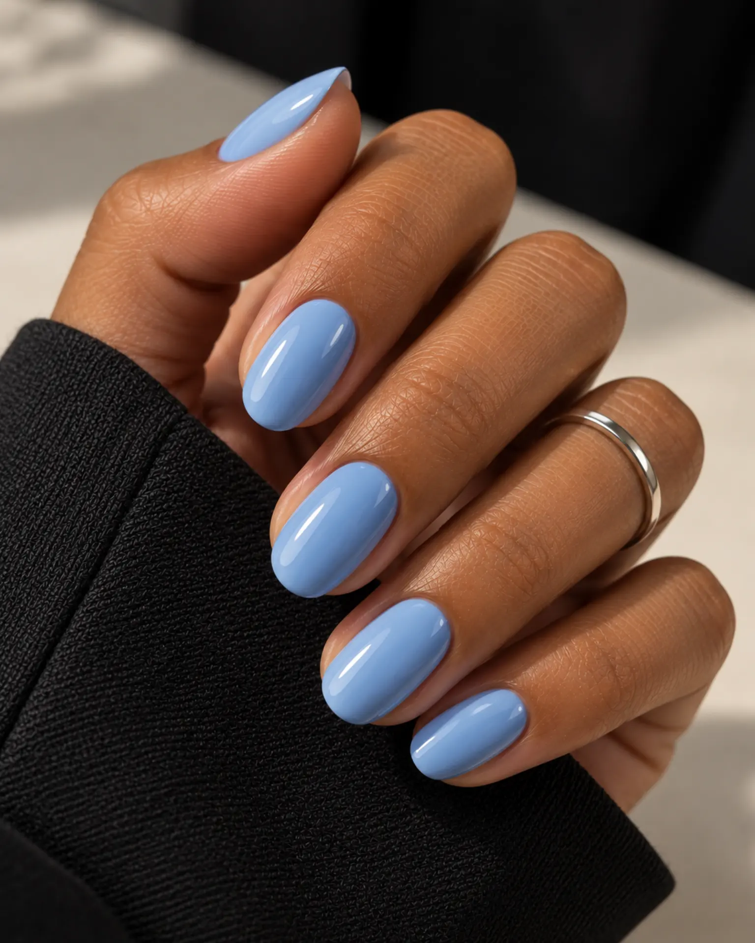
Powder Blue High-Gloss Solid feels more considered when you account for the shade: powder blue gives a pale cool base that can appear gray in shade. A single glossy tone highlights the shape and polish quality without needing a decorative element. Ask for clean coverage around the cuticle rather than extra ornament.
Denim Micro French
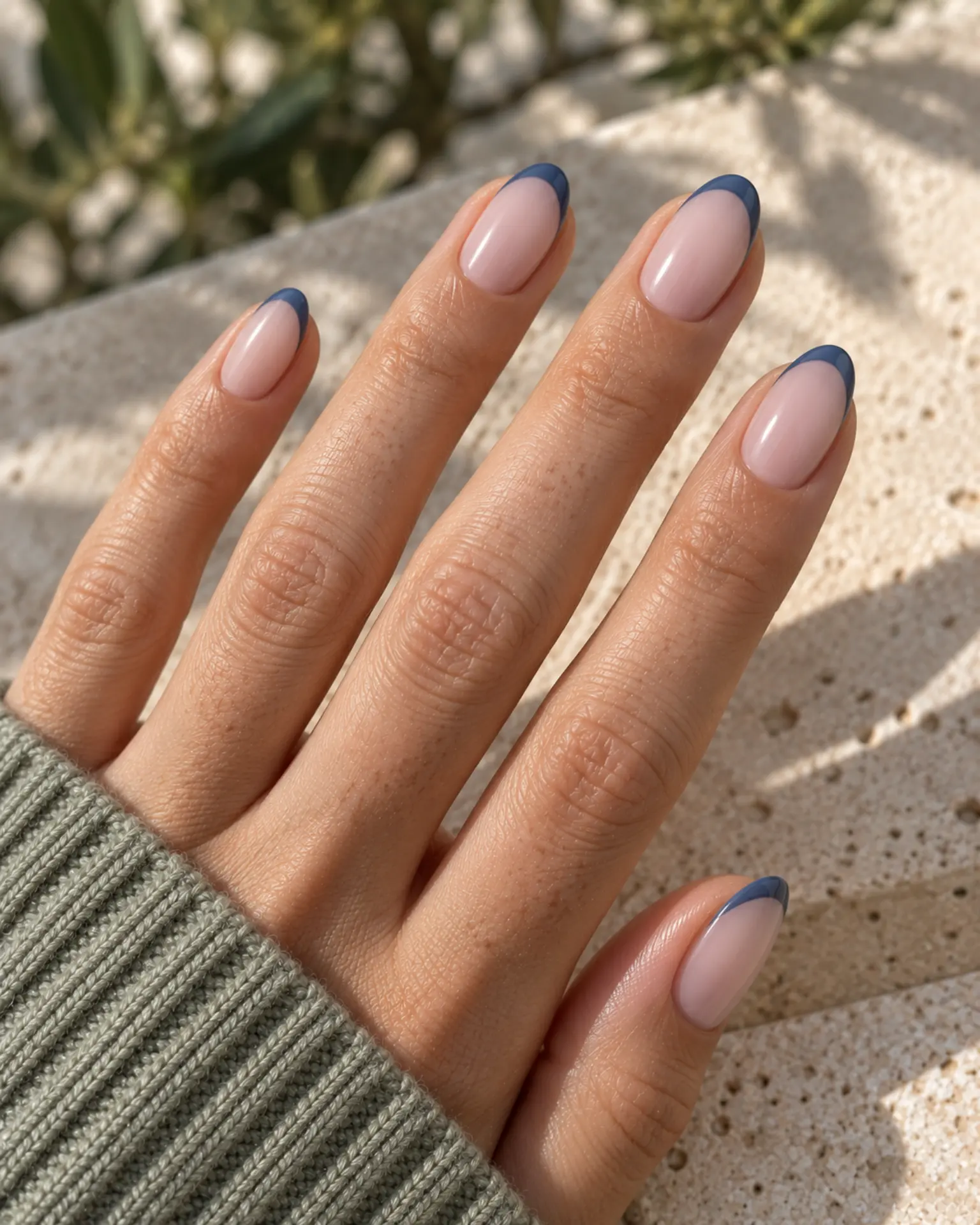
Before adding extra details to Denim Micro French, check the undertone. Denim blue is less saturated than cobalt and often feels more casual. A hairline of color at the very edge lets the base remain visible and makes even compact nails look tidy. A clean base and even topcoat let the chosen undertone do more of the work.
Cobalt Soft Aura
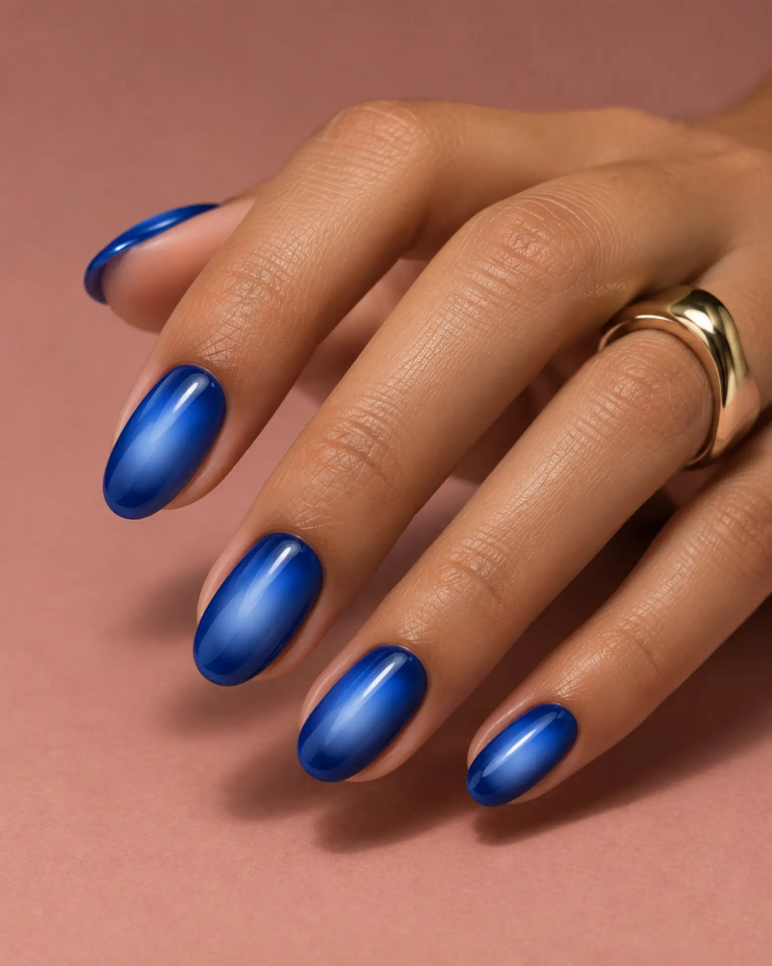
Cobalt Soft Aura feels more considered when you account for the shade: cobalt is saturated enough to carry the manicure without other decorations. The center halo should diffuse into the base. A tight gradient has more presence; a wide, soft fade feels atmospheric. Match the accent size to the nail plate rather than forcing the same dimensions on every finger.
Navy Jelly Wash
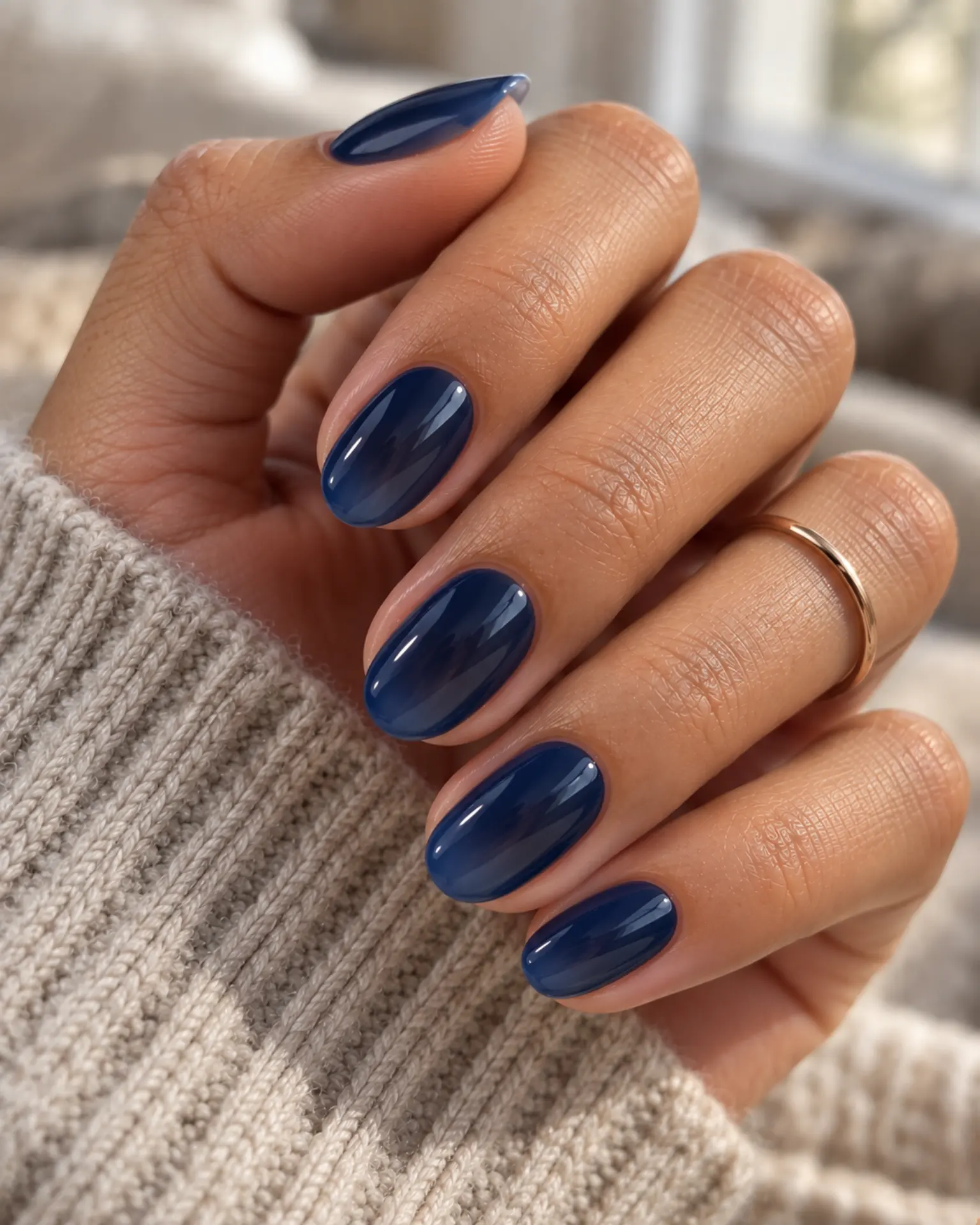
Navy Jelly Wash feels more considered when you account for the shade: navy adds the impact of dark polish with a detectable blue undertone. Translucent layers create a colored-glass effect rather than a solid opaque block. The nail underneath is meant to show through. Ask for clean coverage around the cuticle rather than extra ornament.
Slate Blue Velvet Cat-Eye
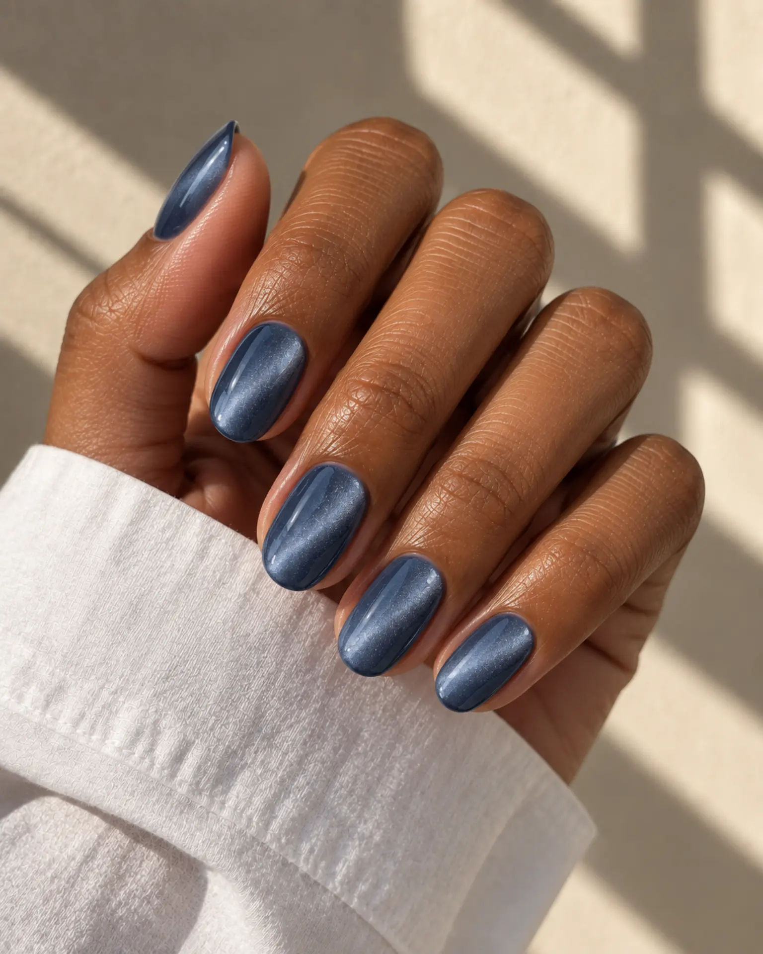
A magnetic shimmer forms a soft shifting beam when light moves across the nail. The direction of that beam is part of the design. Blue looks very different under cool daylight and warm indoor bulbs. That is an important part of the look in Slate Blue Velvet Cat-Eye. A clean base and even topcoat let the chosen undertone do more of the work.
Powder Blue Chrome Glaze
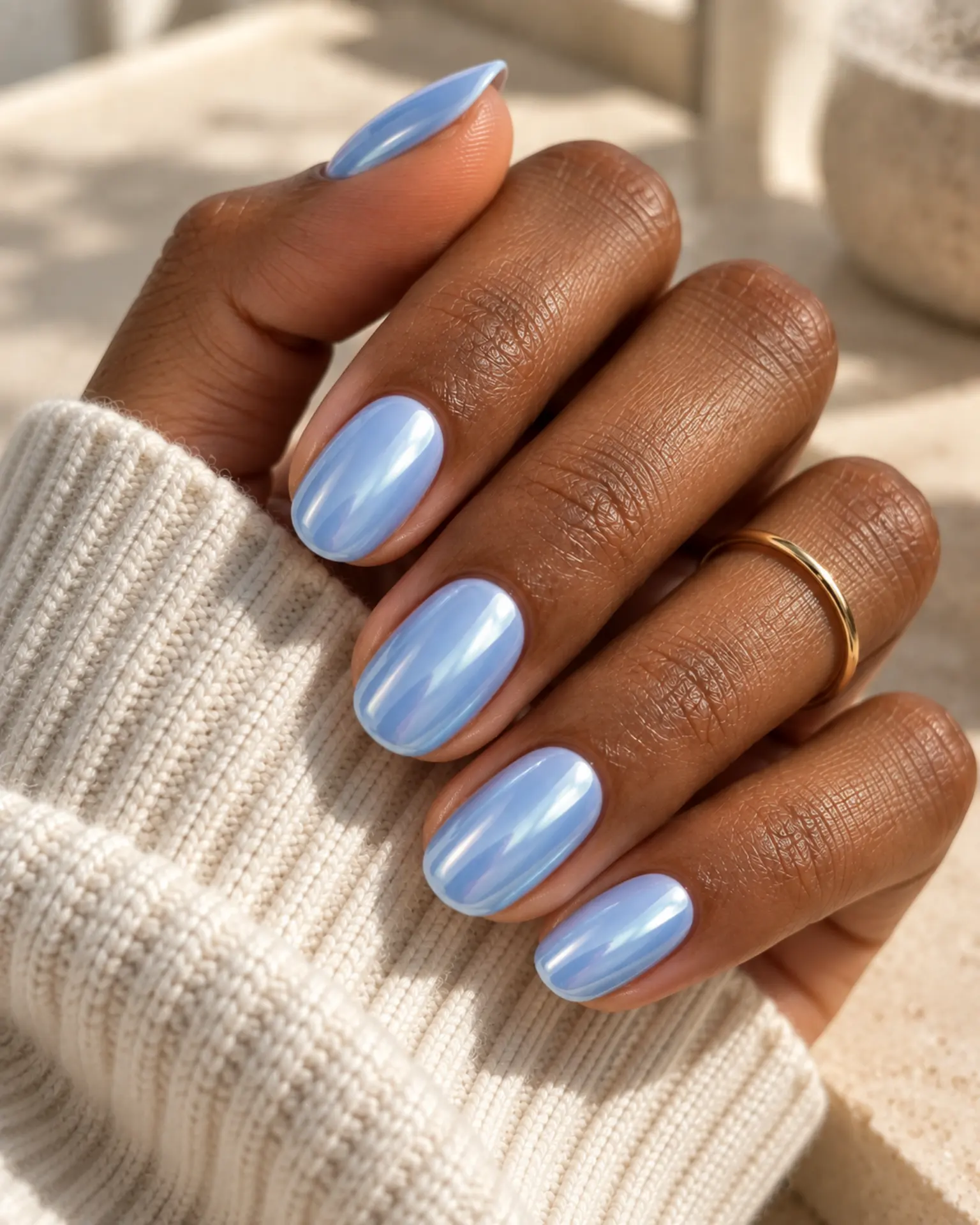
For Powder Blue Chrome Glaze, remember that powder blue gives a pale cool base that can appear gray in shade. A smooth reflective finish changes character with the underlying base: pale colors look pearly, dark bases look more metallic. Choose whether you prefer a soft pearl or more intense reflection.
Denim Negative Space
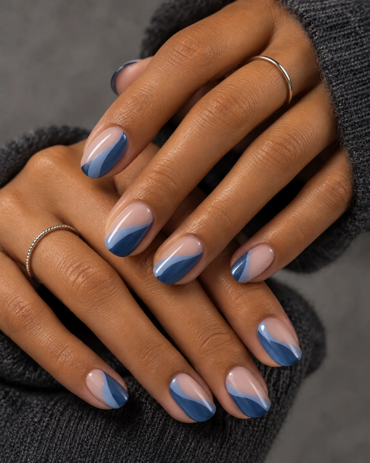
Denim Negative Space feels more considered when you account for the shade: denim blue is less saturated than cobalt and often feels more casual. Leaving part of the nail deliberately open creates contrast through shape, not extra pigments. The border needs to be crisp. Against a shorter shape, this detail can be scaled down without changing the color story.
Powder Blue to Slate Blue Tonal Mix
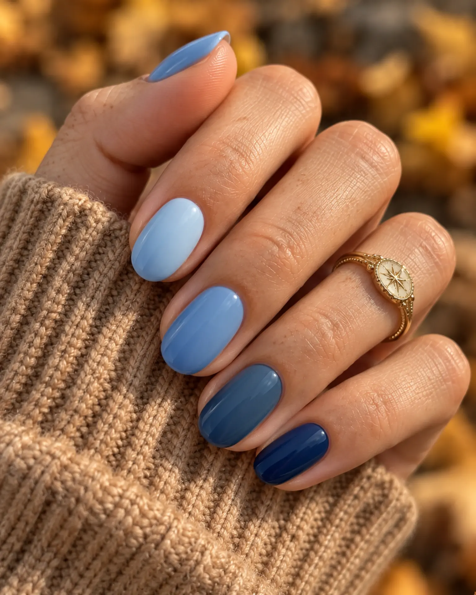
A tonal set reads best when the order of lighter and darker fingers is planned rather than improvised. Powder Blue to Slate Blue Tonal Mix feels more considered when you account for the shade: powder blue gives a pale cool base that can appear gray in shade. Compare all swatches next to each other before applying.
Blue Velvet Cat-Eye
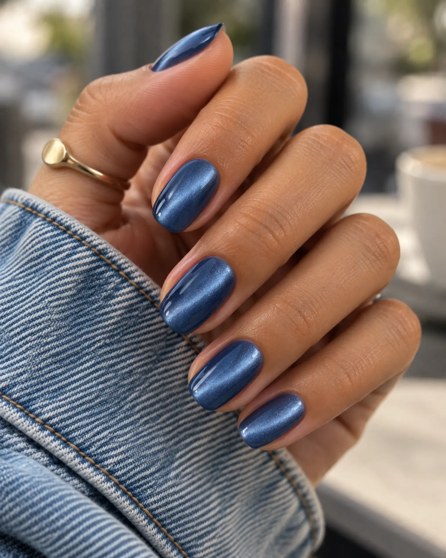
A magnetic shimmer forms a soft shifting beam when light moves across the nail. The direction of that beam is part of the design. Before adding extra details to Blue Velvet Cat-Eye, check the undertone. Blue looks very different under cool daylight and warm indoor bulbs. Look from different angles before the polish is cured.
Blue Micro French Edge
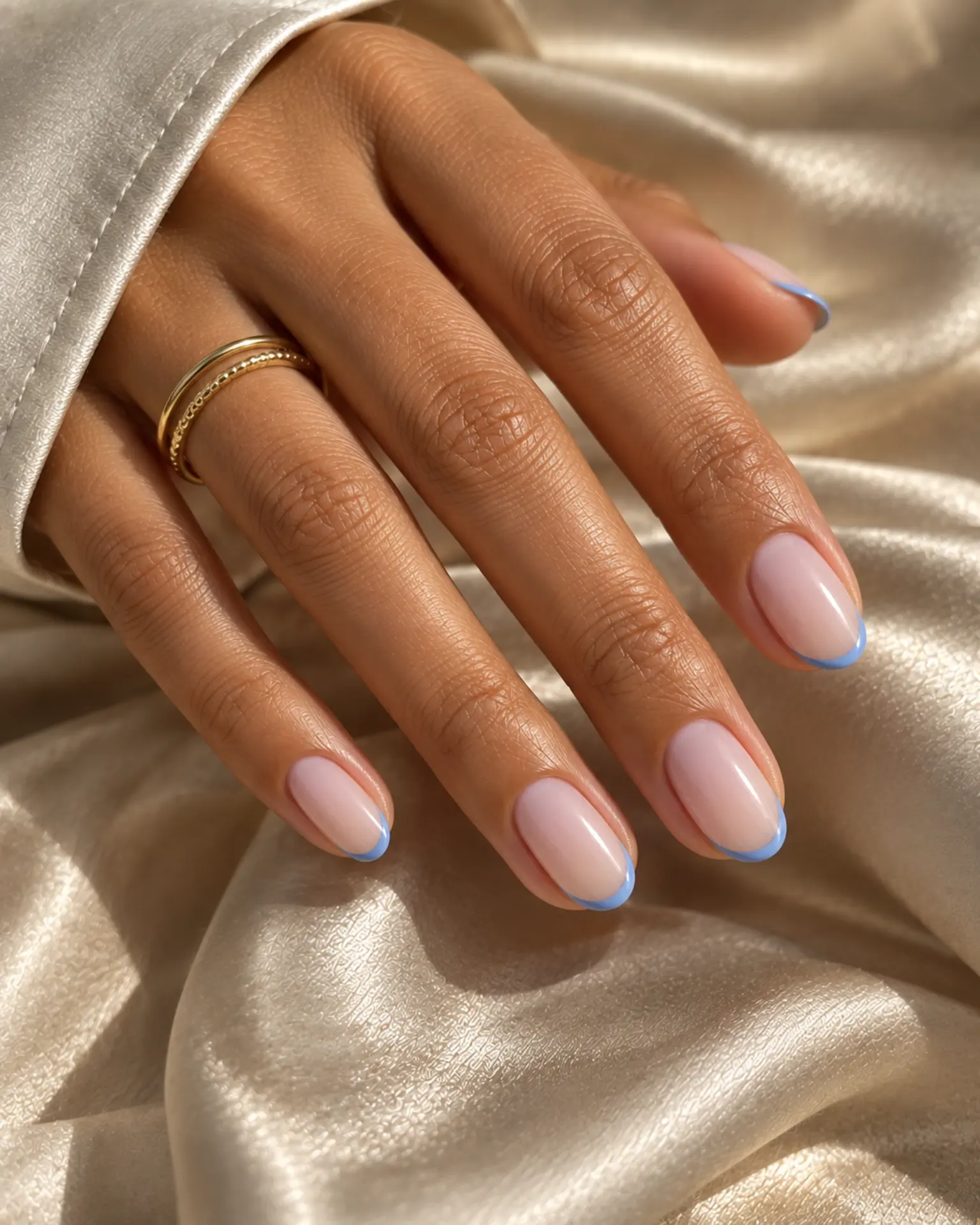
The success of a micro French depends on how slender the tip stays. Too much product quickly turns it into a full-width band. Blue Micro French Edge feels more considered when you account for the shade: blue looks very different under cool daylight and warm indoor bulbs. Ask to see the tip against the nail length before curing.
Blue Sheer Jelly Wash
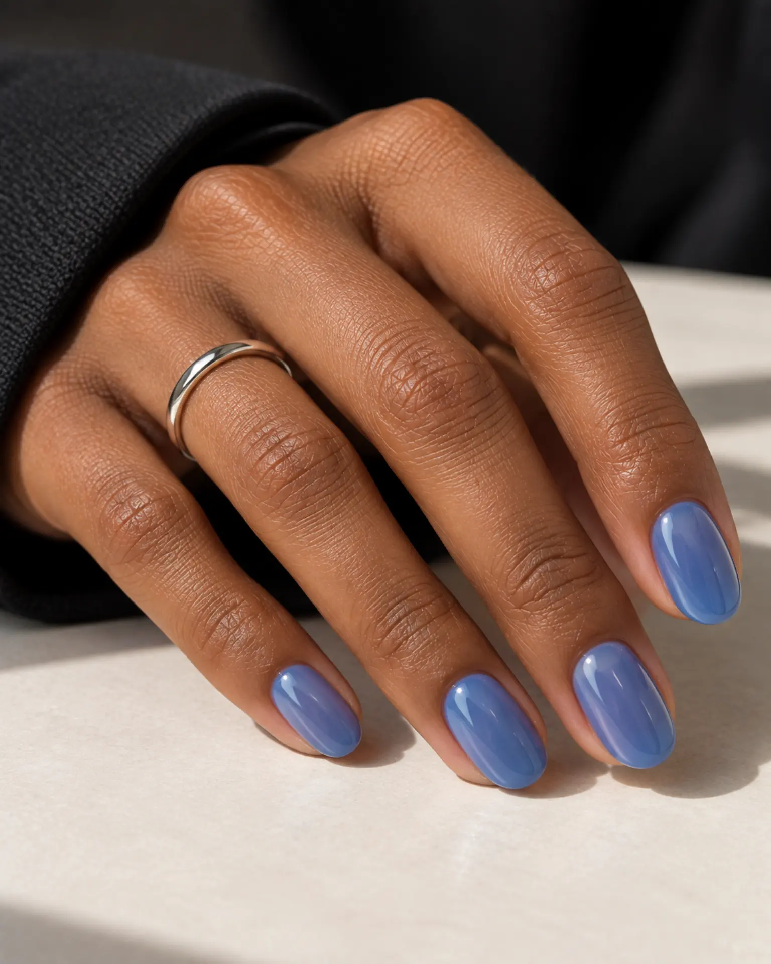
Blue looks very different under cool daylight and warm indoor bulbs. That is an important part of the look in Blue Sheer Jelly Wash. Jelly polish looks deep because the tint builds gradually. Too many coats can hide the transparency that makes it special. Set the opacity target before the final coat.
Blue Tonal Aura Fade
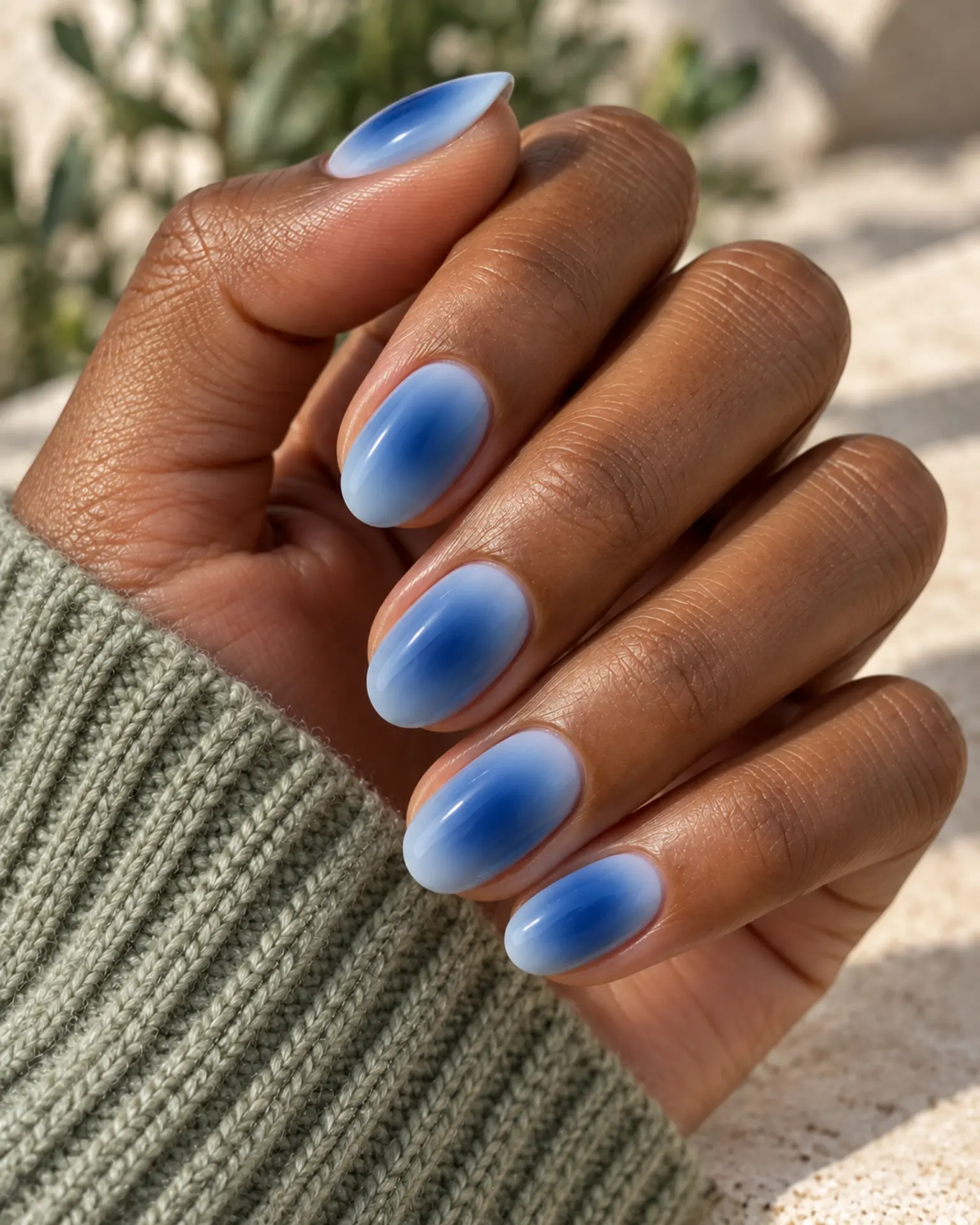
Blue looks very different under cool daylight and warm indoor bulbs. That is an important part of the look in Blue Tonal Aura Fade. A blurred center of color creates a glow that fades gently toward the edges, with no hard circular border. Match the accent size to the nail plate rather than forcing the same dimensions on every finger.
Blue Chrome Outline
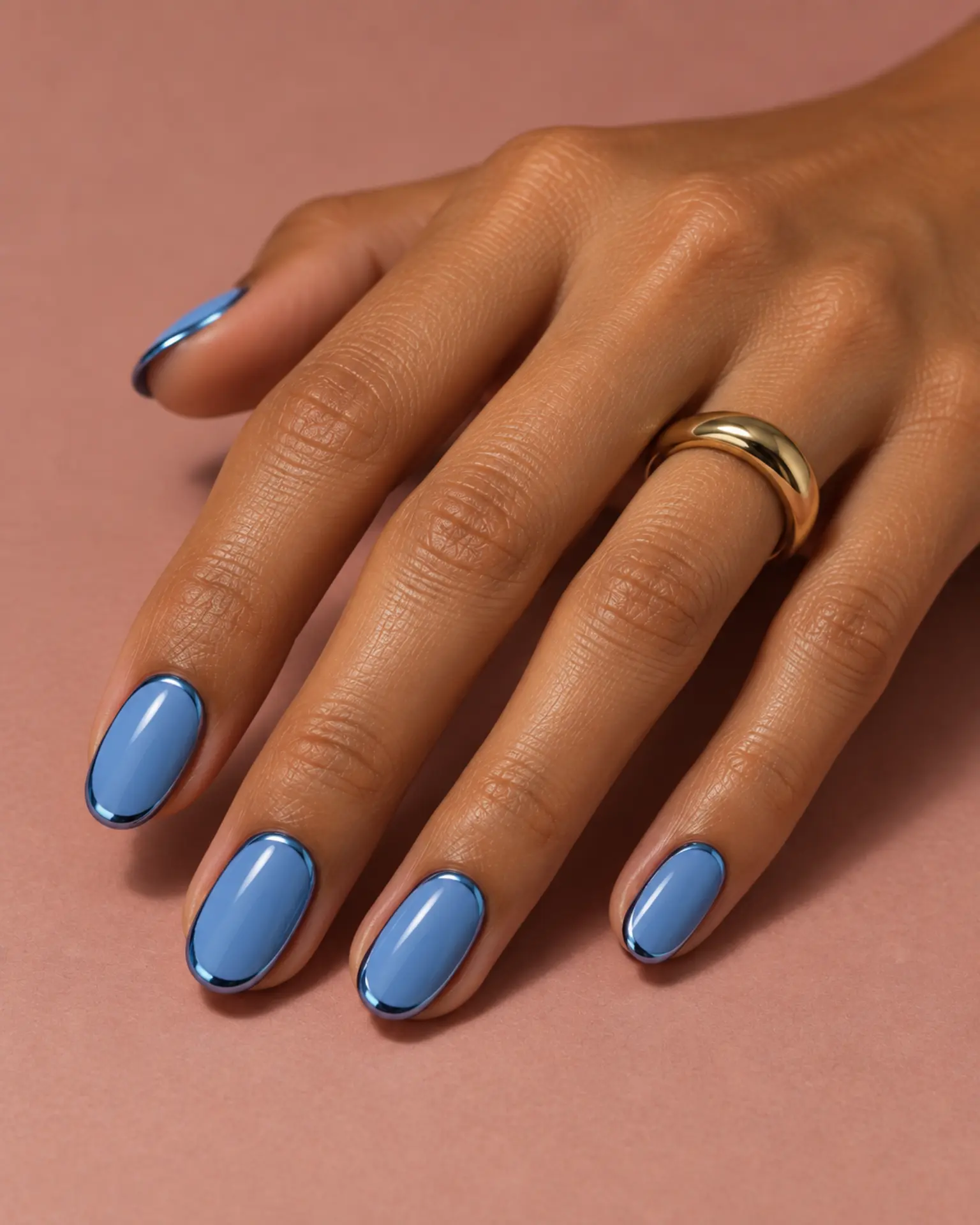
A smooth reflective finish changes character with the underlying base: pale colors look pearly, dark bases look more metallic. Before adding extra details to Blue Chrome Outline, check the undertone. Blue looks very different under cool daylight and warm indoor bulbs. Choose whether you prefer a soft pearl or more intense reflection.
Blue Negative-Space Curve
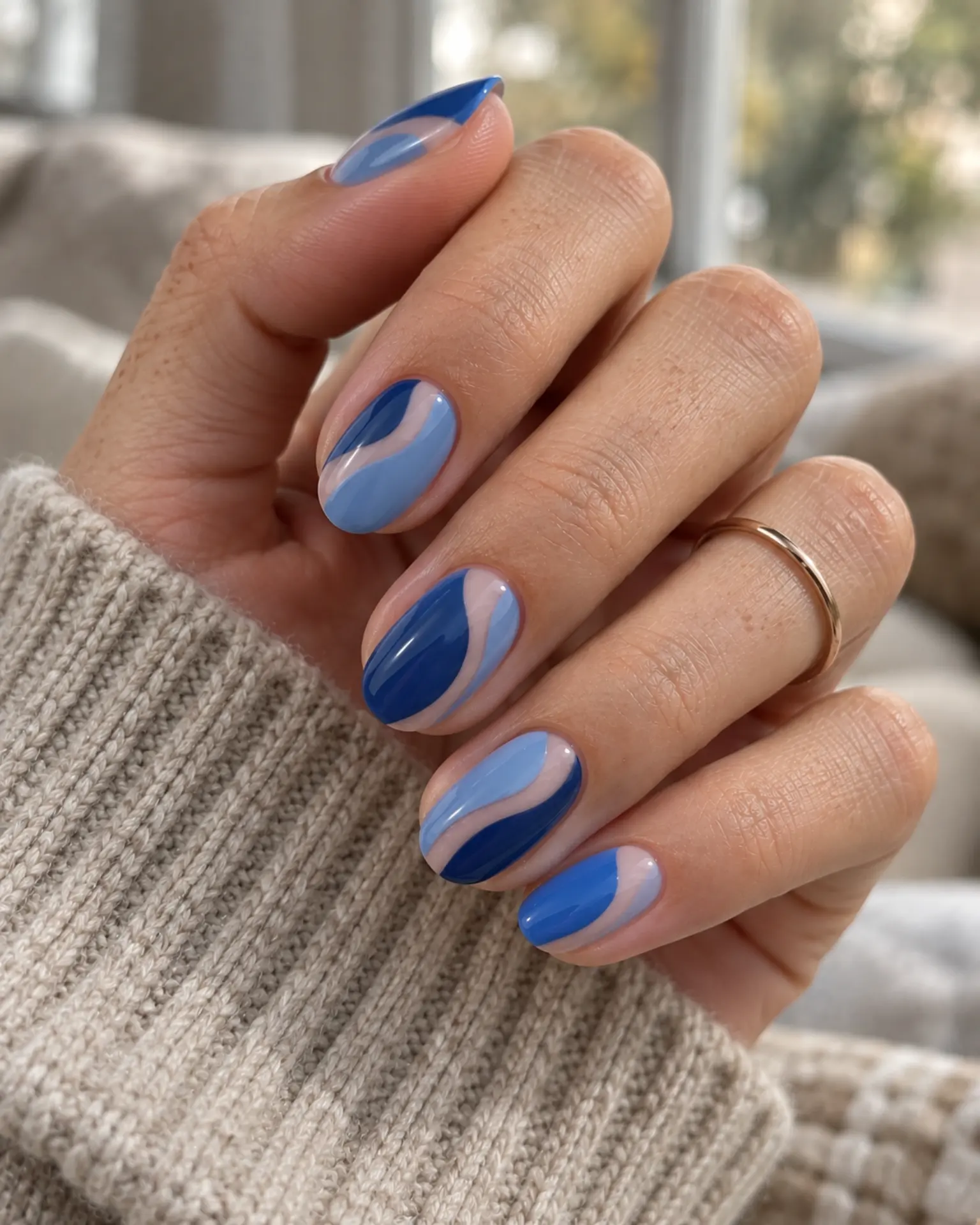
Leaving part of the nail deliberately open creates contrast through shape, not extra pigments. The border needs to be crisp. Before adding extra details to Blue Negative-Space Curve, check the undertone. Blue looks very different under cool daylight and warm indoor bulbs. Check the negative space from a normal viewing distance.
Blue Glazed Pearl Veil
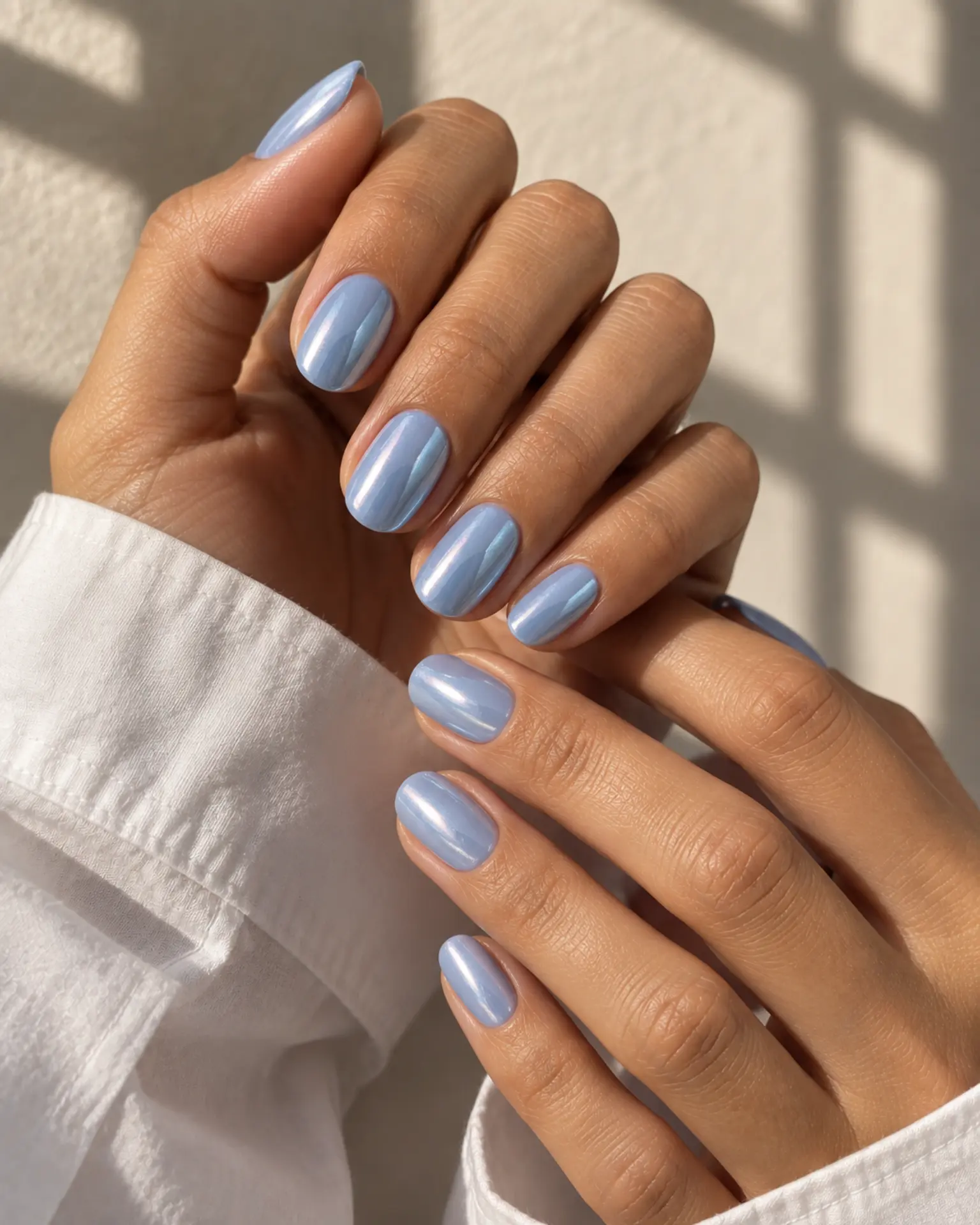
For Blue Glazed Pearl Veil, remember that pearl creates a softer shift of light than metallic foil. The glazed finish is a softer version of chrome, relying on a thin luminous layer and a tidy base. Match the accent size to the nail plate rather than forcing the same dimensions on every finger.
Blue Tonal Ombré
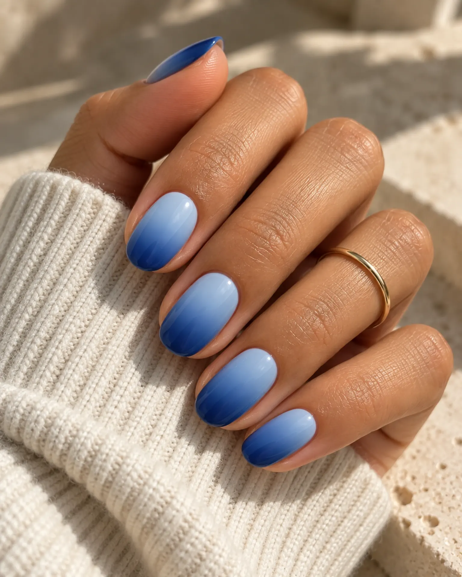
Blue looks very different under cool daylight and warm indoor bulbs. That is an important part of the look in Blue Tonal Ombré. Two related tones dissolve into one another along the nail, avoiding a sharp dividing stripe. Against a shorter shape, this detail can be scaled down without changing the color story.
Blue Side-French Sweep
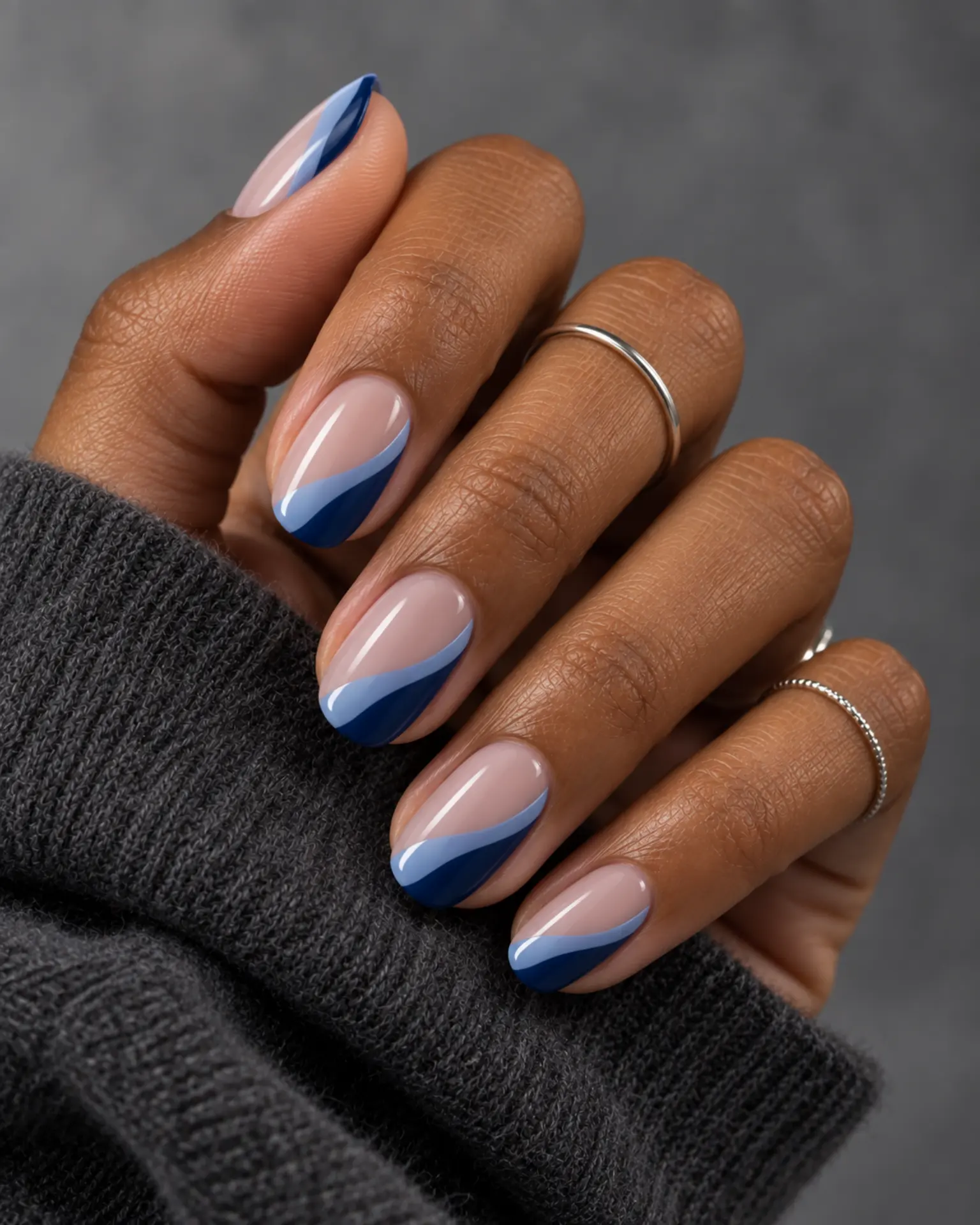
An off-center French edge follows one sidewall before tapering toward the tip. The diagonal direction can make the nail feel longer. Blue looks very different under cool daylight and warm indoor bulbs. That is an important part of the look in Blue Side-French Sweep. Agree on which side carries the color so the two hands feel balanced.
Blue Fine-Line Swirl
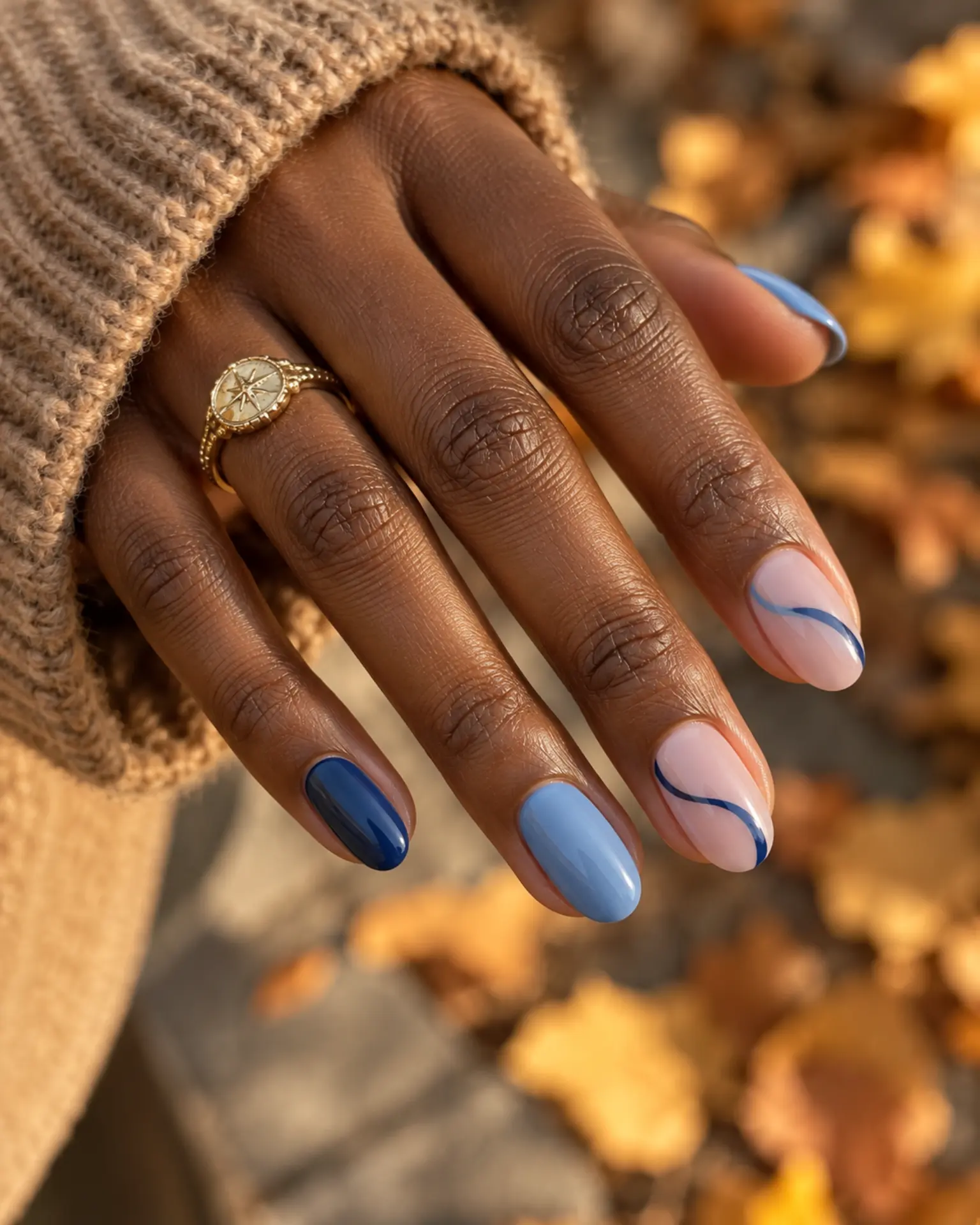
For Blue Fine-Line Swirl, remember that blue looks very different under cool daylight and warm indoor bulbs. One flowing stroke creates movement along the nail, leaving space for the base color to show around it. Match the accent size to the nail plate rather than forcing the same dimensions on every finger.
Blue Matte + Gloss Tip
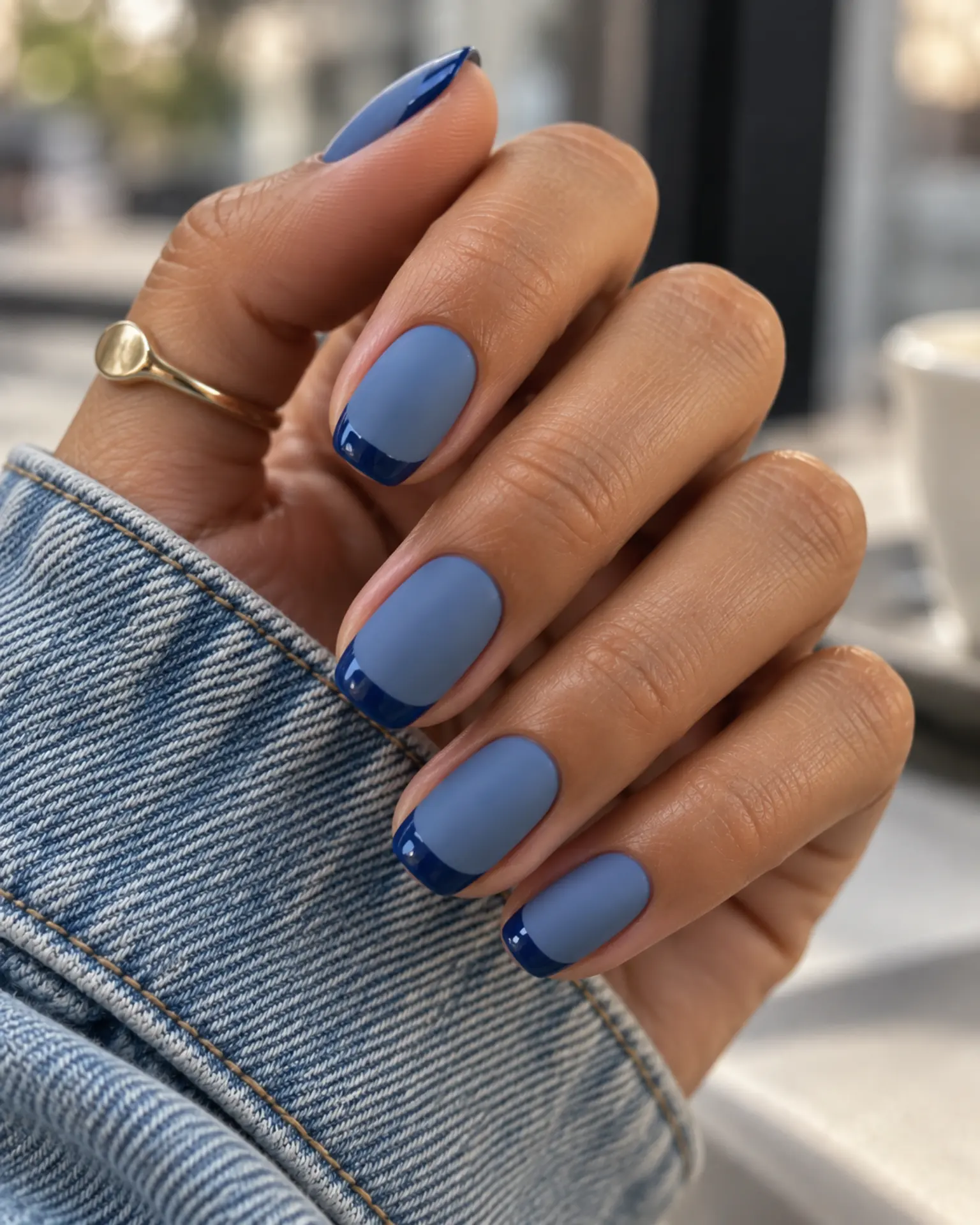
Glossy edges against a matte body create contrast without a second color. The border between finishes should stay crisp. Before adding extra details to Blue Matte + Gloss Tip, check the undertone. Blue looks very different under cool daylight and warm indoor bulbs. Confirm where topcoat should and should not go.
Blue Half-Moon Detail
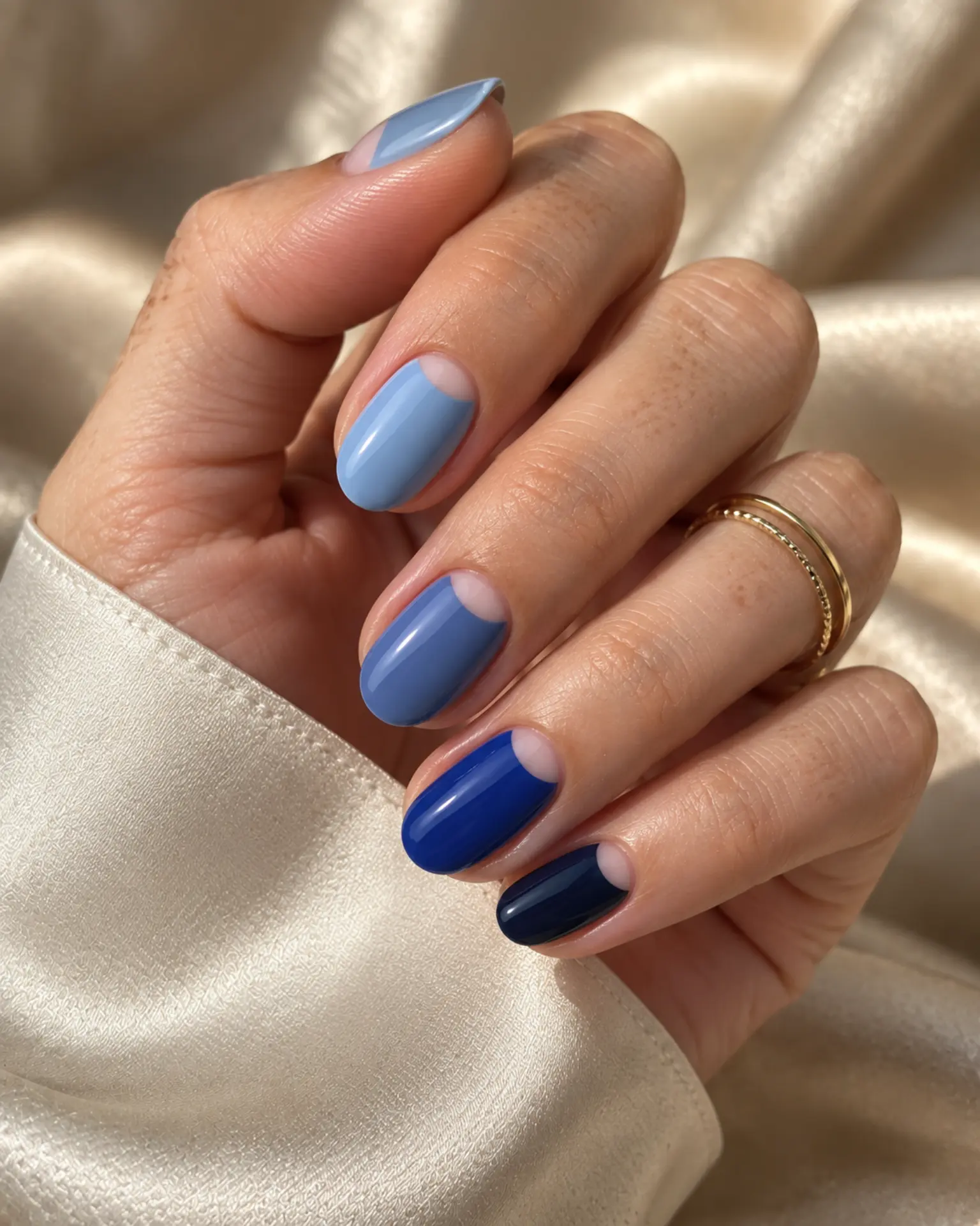
A reverse French frames the nail base. Its curve should echo the cuticle shape instead of copying the width of a tip line. Blue looks very different under cool daylight and warm indoor bulbs. That is an important part of the look in Blue Half-Moon Detail. A clean base and even topcoat let the chosen undertone do more of the work.
Blue Reverse French
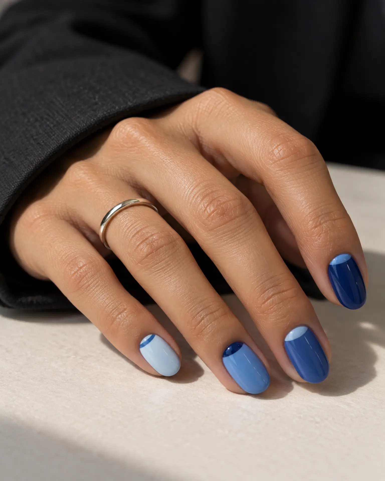
The color sits in a narrow arc near the cuticle rather than at the free edge. A small, even gap makes that placement look clean. Blue Reverse French feels more considered when you account for the shade: blue looks very different under cool daylight and warm indoor bulbs. Keep the crescent shallow if your nail beds are short.
Blue Micro-Dot Accent
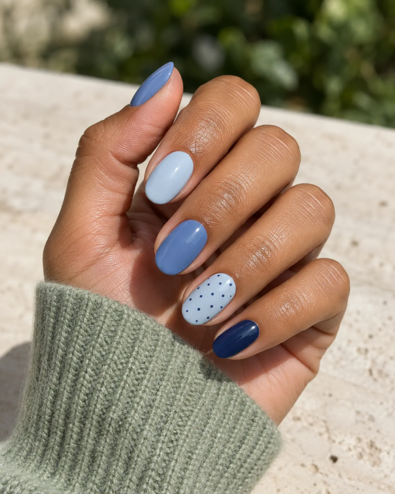
The polish background acts as negative space for the dots; keeping their scale consistent helps the pattern stay crisp. Blue Micro-Dot Accent feels more considered when you account for the shade: blue looks very different under cool daylight and warm indoor bulbs. Plan the spacing before adding more marks.
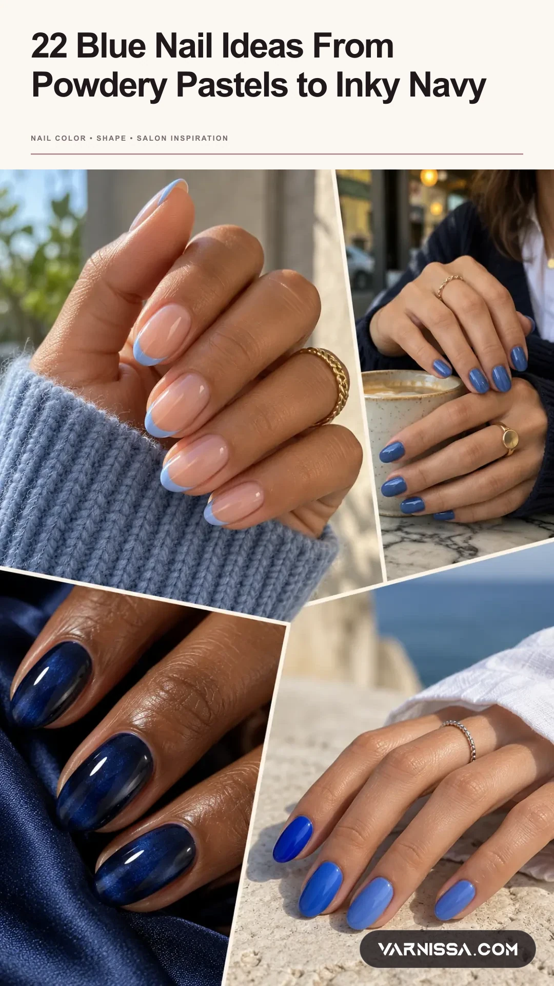
Keep this story on Pinterest.
The vertical Pin packages the article into one branded reference so you can come back to the full set before your appointment.
Questions about blue nail ideas
How is powder blue high-gloss solid different from blue tonal aura fade?
Powder Blue High-Gloss Solid emphasizes even full-coverage color, while Blue Tonal Aura Fade focuses on a diffused center glow. Decide which detail matters most and ask the nail artist to adapt that feature, rather than copying the whole photo at any length.
Why can the polish shade look different from the saved picture?
Reference images are affected by lighting, skin undertone, and image processing. Ask to compare swatches in natural daylight and with the salon light turned on.
What should I bring to request blue nail ideas at a nail appointment?
Save a full-hand image showing even full-coverage color and, if helpful, a close-up showing a diffused center glow. State your nail length and preferred opacity, then agree on which part of the design is essential.